
How mobile friendly is your site?
Is it as easy to view on mobile as it is on tablet and desktop?
Responsive web design ensures users have a good viewing experience no matter what type of device they’re using.
It has become increasingly important as mobile device ownership has exploded - and now that Google is prioritising mobile-friendly sites in its search results algorithm, it is essential that sites are optimised for mobile by using responsive design.
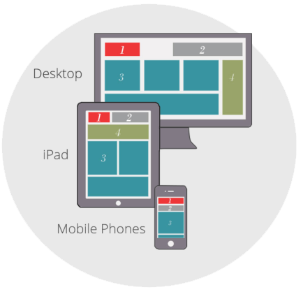
A mobile friendly, responsive design ensures that the elements on your websites adjust to the size of your device. This fluid design does not compromise the readability. The text stays the same size and elements realign on the page, follow the red element on the graphic to see what I mean.
Your site's appearance on Retina and HD screens depends on the original size of the images. We re-size images to up to seven versions, each with a different width. Our built-in responsive design automatically detects the visitor's screen and picks the best image size to fit it.
Choosing to adopt responsive web design in your development isn’t a decision to be taken lightly. Because Google prioritises a site’s mobile viewing experience into the factors in its SEO algorithm, responsive design isn’t a choice—it’s essential if you want your site to be visible in search results.